Designing for the Screen, Not the Pixel
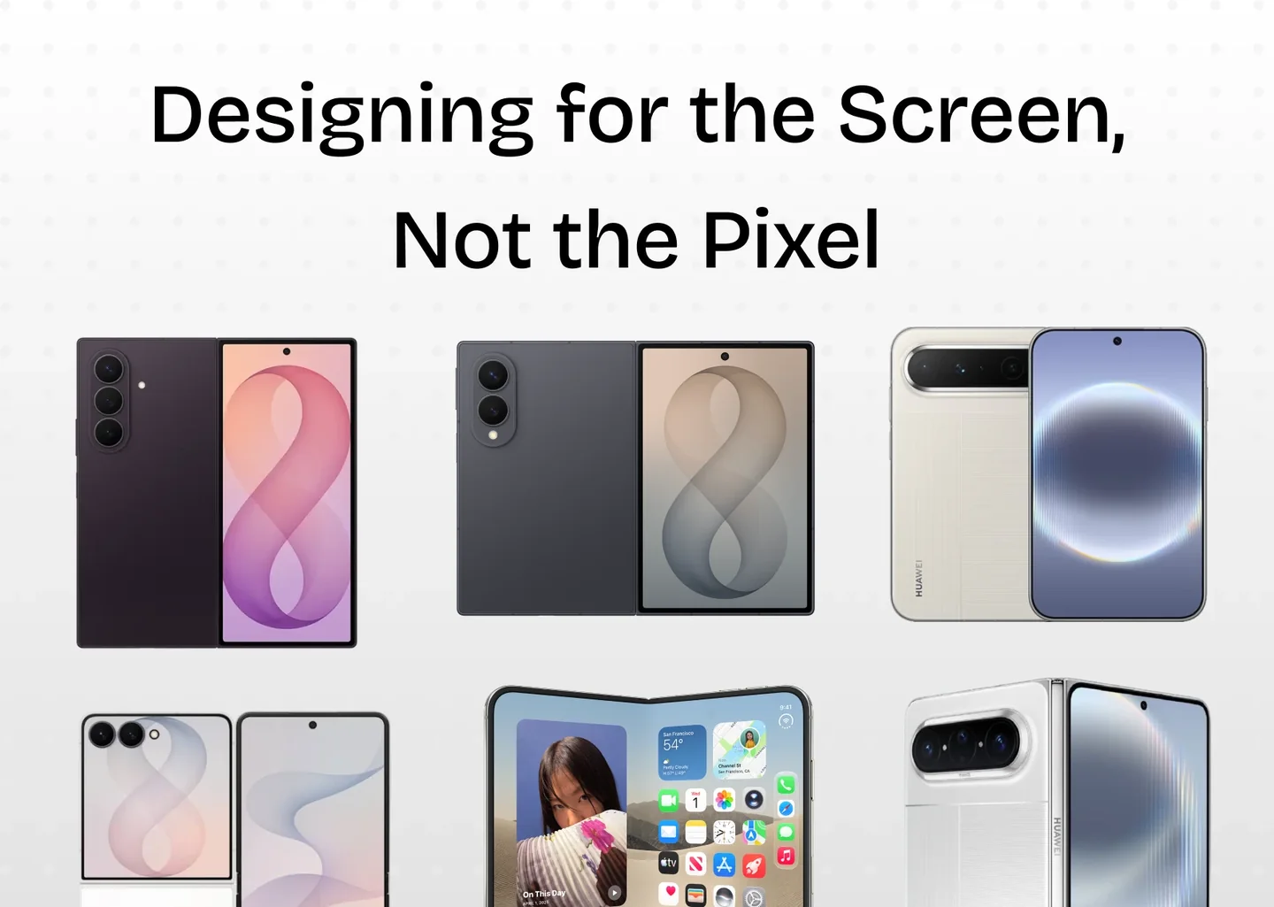
Some resources I collected, in case we need to explain why our app needs adaptive layout - not fixed-position buttons placed there purely for the aesthetic look.
Fixing pixel by pixel, component by component, just to say that “my app fits the new foldable phone” is a temporary solution, and it is so unstable. You can do this, but until when?
The good news? Manufacturers already give us adaptive capabilities through their UI frameworks, so our job can be a lot easier if we make use of them.
We can also utilize the belief that Apple is selling their phones to the market, and the readiness of the app experience is one of the key factors that can make a new device debut successful: how quickly consumers can enjoy their daily tasks on a new device and a new screen ratio.
It is not only about Duo
We already have Galaxy Z Fold, Z Flip, Huawei Pura X… and as you can see, more screen ratios will appear.
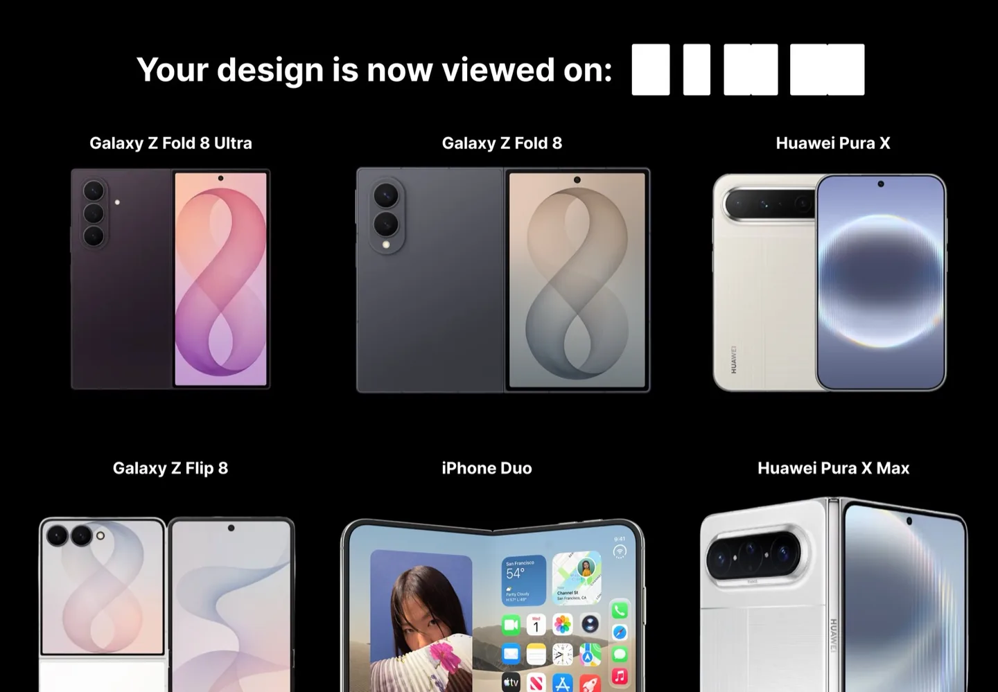
So, back to the assumption: will the ability to be responsive to different screen sizes be considered the bare minimum in app development?
And this is more important: how can we communicate with clients and help them understand that pixel-perfect or absolute aesthetic requirements may not be appropriate anymore?
Of course, there are special cases: an app for a Greek museum, or something where the visual composition is intentionally fixed. But as designers, we now have a new job: explaining how the design in the client’s mind can adapt to various screen sizes, when the situation forces us to do so.
It could be just a quick POC in Figma showing how the app adapts to different screen ratios. Or it could be a live demo. It’s your choice.
What the screen is actually doing now
A screen is no longer one canvas with one job. It folds, it splits, it gets shared with two other apps, and it changes posture while the user is mid-task.
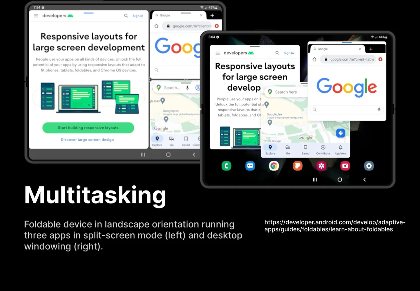
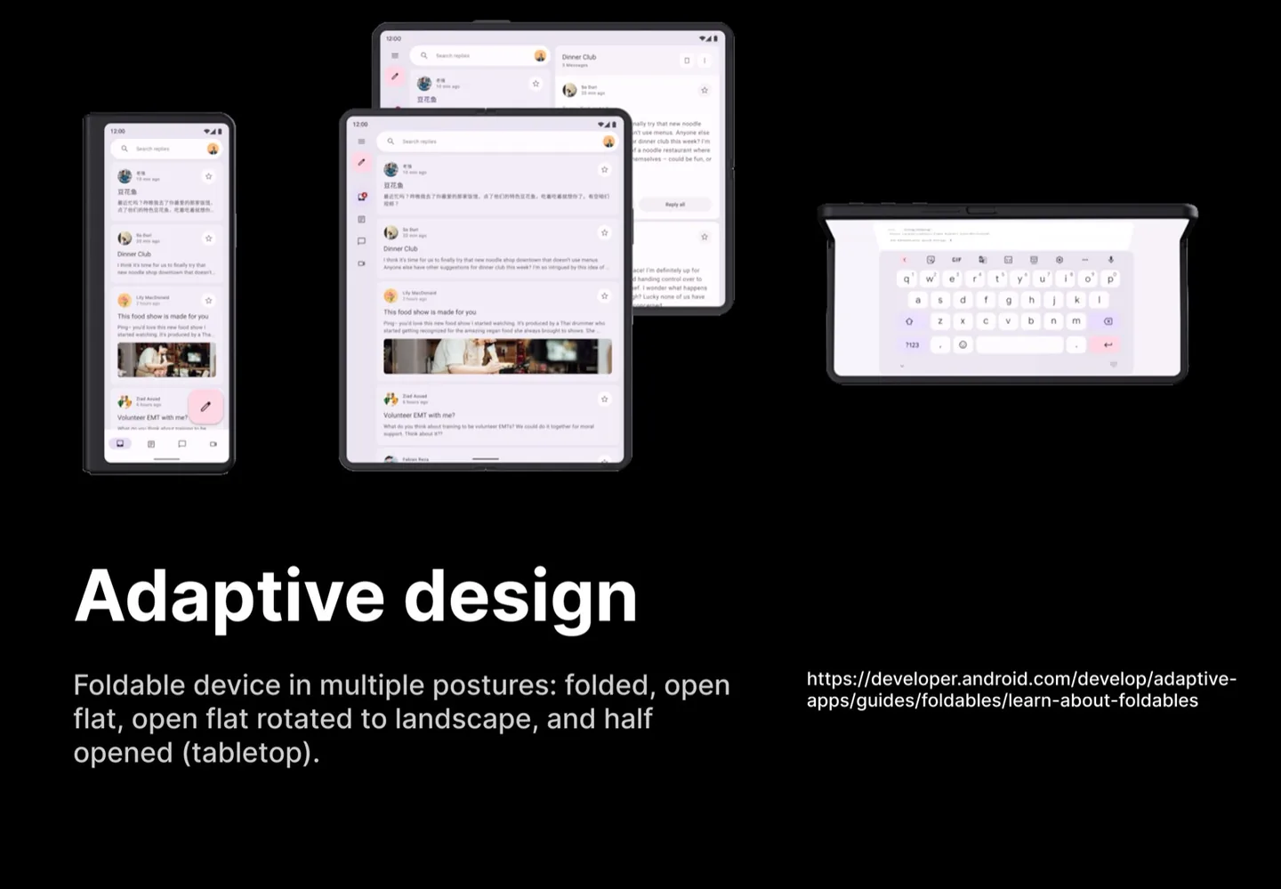
If you count the combinations 🥵 posture × orientation × window size — the number of “screens” you would have to hand-fix pixel by pixel stops being a number you can plan a sprint around.
The manufacturers already said it out loud
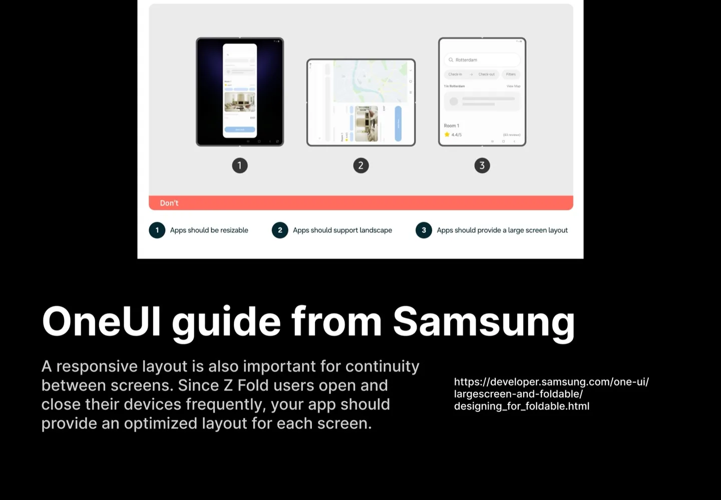
Three “don’ts”, stated plainly: apps should be resizable, apps should support landscape, apps should provide a large screen layout. That is a useful thing to put in front of a client: it is not our opinion, it is the platform’s requirement.
The pattern to aim for
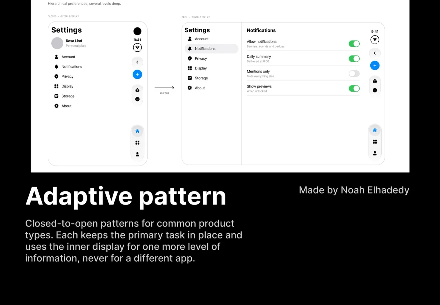
Closed-to-open patterns for common product types: each one keeps the primary task in place and uses the inner display for one more level of information, never for a different app. That last part is the whole principle, and it is the sentence I would bring into a client conversation: unfolding gives you one more level of information, not a different app. The user’s task does not restart when the hinge opens.
Resources you might find helpful
- 🎥 Flexible Layout in “Prepare your app for iPhone Duo” (1:42) — youtube.com
- 📖 Apple’s suggestion: “Group related toolbar items instead of spacing them manually” in Designing for iPhone Duo — developer.apple.com
- 🎯 Adaptive design in Android: a live video showing how an app is optimized for both folded and unfolded screens — developer.android.com
- 🎨 Adaptive pattern between folded and unfolded screens, Figma — figma.com/community