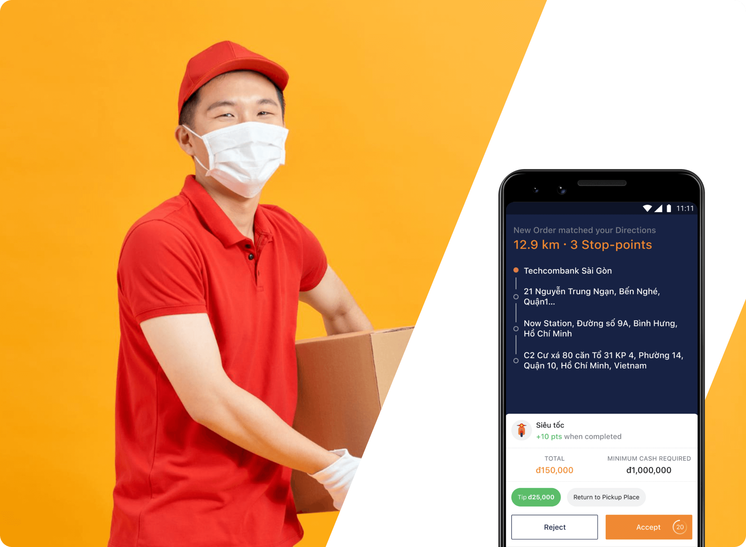
Maximize Your Delivery Efficiency
How to Prevent Canceled Orders as a Driver
Design completed in November, 2019
Reported Issue
During our bi-weekly meeting with the CS department, we learned that a significant number of drivers were canceling orders they had previously accepted. This was often due to additional notes or requirements from customers that were not visible to the drivers when they first reviewed the order information.
Current Design Analysis
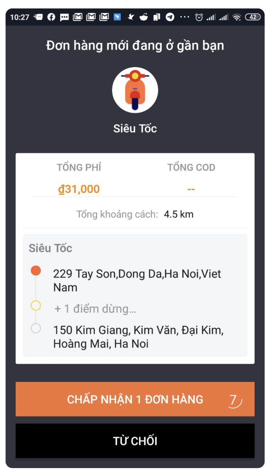
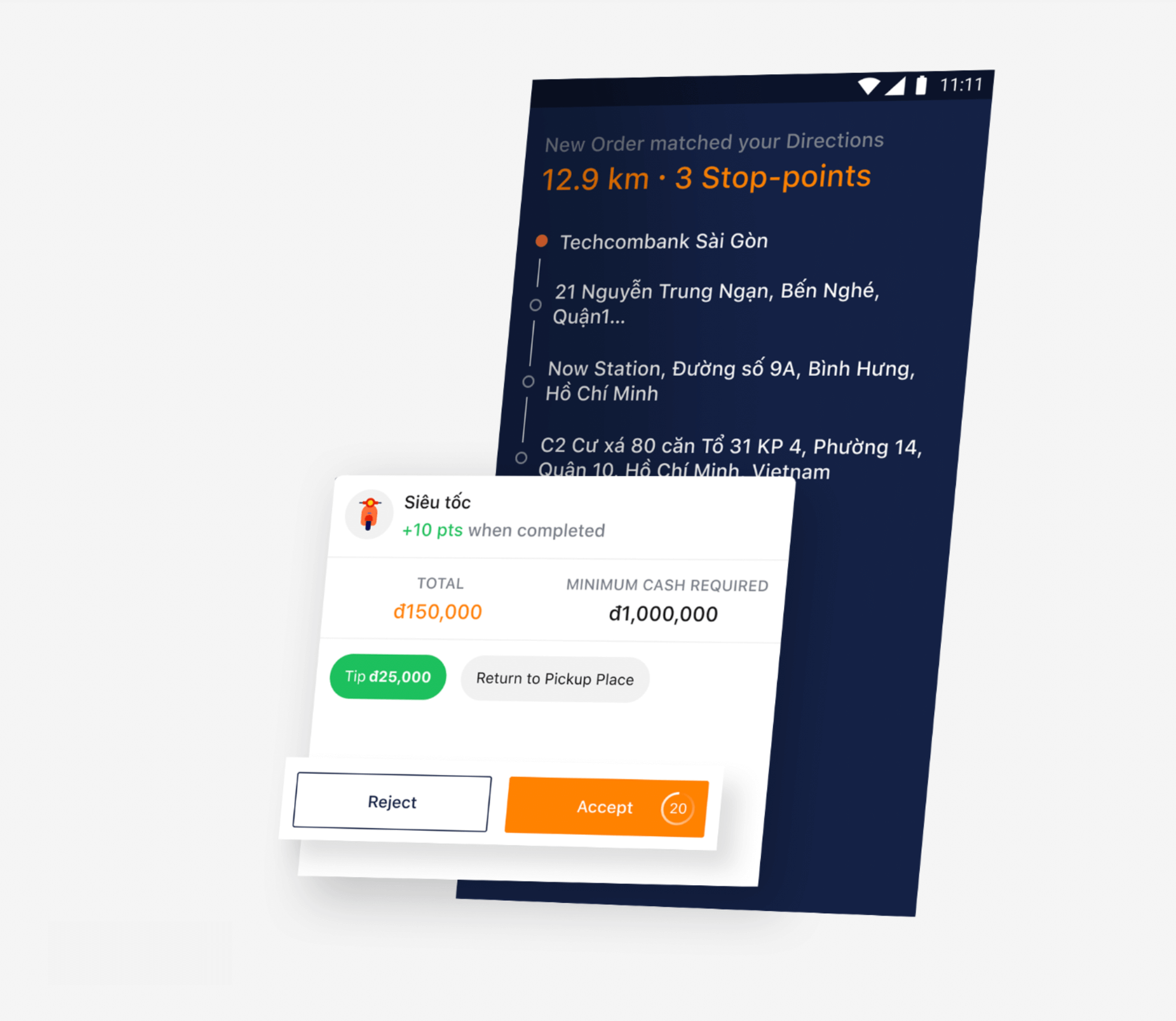
We decided to take a look at the current design, specifically the order information which drivers have to read when receiving an order.
Issue 1: Lack of motivation
Displaying points or tips earned on the summary screen incentivizes drivers to provide excellent service.
Issue 2: Lack of information
Displaying special instructions or notes on the summary screen ensures drivers have necessary information for successful delivery.
Issue 3: Lack of info on additional services
Displaying information on additional services on the summary screen allows drivers to offer them to customers, generating revenue and enhancing experience.
How can we make this better?
A. Optimize Space
Minimize the space used for the service icon to make it a minor part of the layout. This will free up more space to highlight other major pieces of information.
B. Improve Visual Hierarchy
To ensure drivers can quickly and easily access all major information, it should be clearly visible and visually appealing. With only 20 seconds to skim, it's important to make every second count.
C. Simplify Actions
To accommodate the limited time drivers have to review delivery details, it's best to avoid additional actions beyond tapping 'Accept' or 'Reject.' Instead, make sure the entire route is visible so drivers can quickly assess the feasibility of the delivery.
D. Maximize Information Display
Maximize the space for order information by minimizing the space used for buttons. By optimizing the layout in this way, drivers can easily access all necessary order details without distractions.
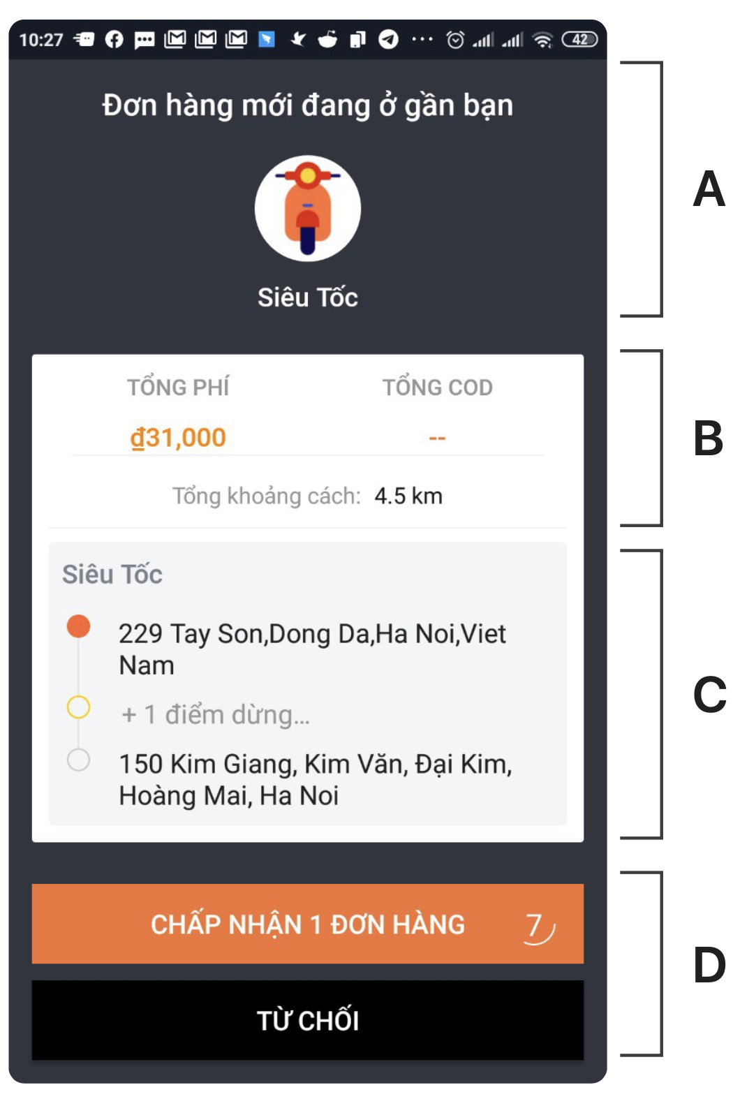
Information Structure of the Current Design
We use a simplified "card sorting" process, where each piece of information is written on a separate card and grouped based on common themes or categories.

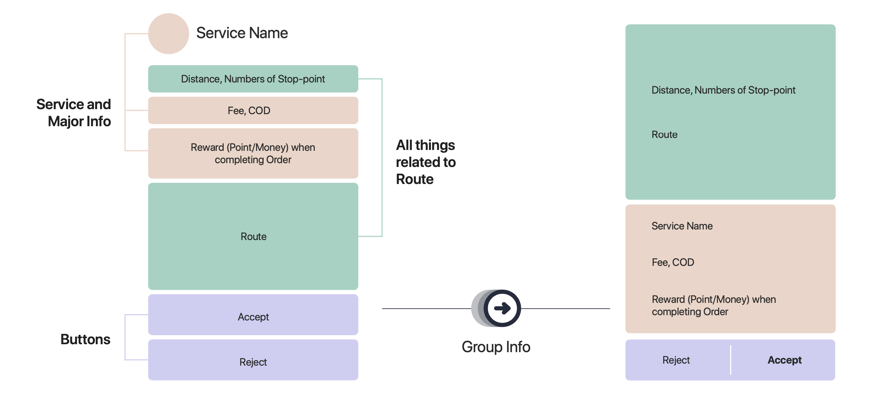
Grouping Related Information
Once you have identified the different categories of information, you can start to prioritize them based on their importance or relevance to the driver. This will help to create a clearer and more intuitive information hierarchy.
Another important aspect of organizing information is to consider the visual layout of the screen. This includes things like font size, color, and spacing, which can all help to make the information hierarchy more visually clear and appealing.
Introducing New Design
Our newly proposed design has been optimized for visual hierarchy and enriched with more informative details, making it easier for drivers to quickly scan and understand the information presented.

An In-Depth Look at the New Design
Breaking Down the Layer Hierarchy

How this solution Can Be Used in Various Scenarios
Once we have decided on a design solution, we consider how it can be applied in different scenarios and adapted to accommodate additional information, such as extra services or notes from senders.
My Takeaways
Prioritize core information
Drivers are busy and always on the go, so it's important to display the most important information in a clear and concise way. Use bigger font sizes to make it easier for them to quickly skim the information they need.
Keep the design simple
Drivers often use older, cheaper phones that may not have the hardware to handle a modern, rich-animation design. Additionally, they frequently mount their phones on their vehicles, so it's important to keep the information as simple and easy-to-read as possible.
Collaborate with other teams
To create an effective solution, it's essential to work closely with customer support teams to understand the drivers' struggles and how your design can alleviate some of their workload. This collaborative approach can result in a more user-friendly experience for everyone involved.