Annotation: A new plugin, and some thoughts on the designer's role in the age of AI
Here’s a truth: the mouse-clicking work of creating layers in Figma is now done by AI. If a designer’s value used to lie partly in knowing where to click and understanding how Figma works, today AI has blurred that line.
Someone who isn’t a designer, overwhelmed by Figma’s feature-packed interface, can now open a familiar chat window, talk to an agent, and get a result. (Quality aside — producing a frame with colored, laid-out layers is far easier than it was before agents.)
As for what to do once AI can produce layers: a UX designer has plenty of directions. Depending on your taste and your existing background, you can lean into motion, code, sharpening how you communicate with clients, design systems… but today I want to talk about Annotation: the skill of going inward to improve the experience for the people closest to you — your teammates and your clients.
Annotation — notes in design — isn’t just naming a flow or marking when components show or hide under certain conditions. What I mean here is visualizing the business and technical logic right inside the interface.
Why would a designer need to visualize technical and business logic right inside Figma?
For yourself
- To model the business flow, you have to understand the business.
- To model the technical flow, you have to understand the engineering.
Is there any path to finding opportunity that doesn’t take the effort of learning something new? Instead of spinning in circles trying to figure out which road wins against a job market that now has AI in it, why not do two things at once: talk more with devs and BAs, read the business docs, read the API docs… You don’t need to understand 100% from the first minute, but at least give it a start. You get to learn something new, and your stakeholders get a more useful design file.
Once you understand the fields adjacent to UX, more roads open up. Which ones depends on where you’re standing — every designer’s crossroads is different, so I don’t have a one-size-fits-all formula.
Once you get it, you can make your Figma more mature by putting in the designs you only remember when a teammate asks:
- What shows if this list fails to load
- What shows if it takes too long and never loads
- What happens if the user loses internet mid-session
- Do we block the user if they hit refresh too many times
- …
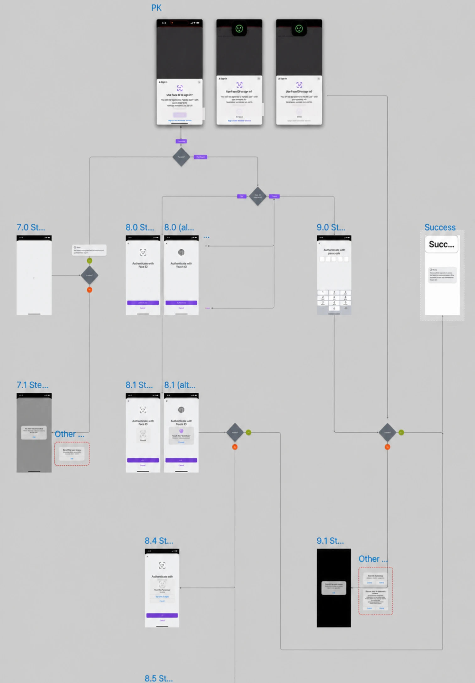
(involves FaceID, TouchID, Passkey, OTP...) — blurred
Once you’re comfortable designing for edge cases, a new phase begins: you get curious, and you start asking questions back.
You sit in meetings and understand what everyone is saying — even the technical-flow ones.
(At my company, every new feature is split into two kinds of meetings: one for business + UX, one for engineering. I join both.)
Once you think in business and engineering terms, it’s a bit of a curse — you design in a tighter space: every decision takes more thought, and on off days you’ll design and forget the user entirely. But I believe that in a world where AI follows some kind of prompt, crafting a balanced solution and knowing how to present it is a designer’s new strength.
In short, for yourself: you get to learn something new, take on new challenges, raise the maturity of your design work, have more to do and think about, and have something to show in interviews — that this design is the result not just of design thinking, but of business and (a little) engineering too.
For your teammates
Writing this all out got long, so bear with me and just imagine by answering these:
- Instead of switching back and forth between Figma and the docs, your teammates can now focus more when your Figma already shows more, right?
- When presenting to a client — especially in multilingual settings — isn’t it better if everything is now shown in your Figma, on the one screen being shared, with no switching back and forth? And the client understands why the design is the way it is, instead of some fancier version in their head, without needing to pull a backend engineer onto a mic to explain.
- If you and the dev team work across time zones, when you close your laptop and go offline, your teammates still understand everything without messaging you — the missing empty state, the failed-to-load state, and so on.
I still hold that a designer, alongside thinking about the user’s experience, should also think about the experience of the people who use their design: the clients and the teammates.
In short: if you don’t mind trying something new that’s drier — engineering — or more pragmatic — business — you can pick a new direction: maximize the Figma experience for your teammates and clients by thinking more about edge cases, and showing them.
That’s why I made this plugin — completely free — so you can generate annotations right as you design: design status, error states, conditional logic, platform indicators (iOS, Android, WEB). You can try it here: